
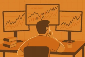
Cracking the Code of the Market
Are you reading candlestick charts correctly? It’s a simple question, but the answer could be the difference between you becoming a profitable trader and another market statistic. Candlestick charts are the language of the market. They are the most direct, unfiltered representation of the battle between buyers and sellers. If you can’t read them, you’re illiterate in the world of trading. This is the ultimate beginner’s guide to candlestick charts. We’re going to break down the anatomy of a candle and then show you how to start using them to predict market direction. No fluff. Just the raw essentials.
The Anatomy of a Candlestick
Every single candlestick tells a story of a specific time period—be it one minute, one day, or one week. It has four key data points. Let’s break it down:
- The Body: This is the thick, rectangular part. It shows you the opening and closing price. If the candle is green (bullish), the bottom of the body is the open and the top is the close. If it’s red (bearish), the top is the open and the bottom is the close. A big body means a decisive move. A small body means indecision.
- The Wicks (or Shadows): These are the thin lines extending above and below the body. They represent the highest and lowest prices reached during that time period. The wicks tell you about the volatility and the struggle. A long upper wick shows buyers tried to push the price high but were beaten back by sellers. A long lower wick shows sellers tried to push it low but were overwhelmed by buyers.
That’s it. Open, high, low, close. Every candle is a self-contained story of a battle. Your job is to learn how to read these stories.
How to Determine Market Direction with Candlestick Charts
A single candle is a letter. A series of candles is a sentence. A full chart is a novel. You don’t trade one candle; you trade the story it’s telling in the context of what came before. The most basic way to determine market direction is by identifying the trend structure using the patterns these candles create.
Identifying an Uptrend
An uptrend is defined by a series of higher highs and higher lows. You look at the clusters of candles. You see a strong push up (an ‘impulsive move’), followed by a shallow pullback. The highest point of the push is the ‘swing high.’ The lowest point of the pullback is the ‘swing low.’ If the next push up breaks the previous swing high, and the next pullback stays above the previous swing low, you are in a confirmed uptrend. Your bias should be to buy.

Identifying a Downtrend
A downtrend is the exact opposite: a series of lower lows and lower highs. You’ll see a strong impulsive move down, followed by a weak rally. As long as the market continues to make new lows and fails to break above the previous swing highs, the trend is down. Your bias should be to sell. This simple structural analysis is the foundation of all profitable trading.
Identifying a Reversal
The trend is your friend until it ends. A trend reversal is signaled by a break in this structure. In an uptrend, if the price fails to make a new high and then breaks *below* the last swing low, the uptrend is over. A reversal is likely. This structural break is the earliest and most reliable signal that control is shifting from buyers to sellers.
100 trading strategies. 1 blueprint.
The Ultimate 100 Trading Strategies gives you a complete arsenal of setups across price action, indicators, and market conditions.
This is your trading playbook, built to scale. Download it. Study it. Deploy it.
Stop Guessing, Start Reading
You don’t need a dozen complicated indicators to trade successfully. Everything you need to know is right there in the candlestick charts. They show you the trend, the momentum, the key support and resistance levels, and the exact moments when control shifts. Learning to read this price action is not a shortcut; it’s the only path. Stop looking for magic signals and start learning the language of the market. The story of who is winning and who is losing is right in front of you. Your job is to read it and bet on the winner.
Why Trade with a Bot?
Because reading the structure of candlestick charts across multiple timeframes is demanding. A bot can analyze market structure, identify trend reversals, and execute trades based on our automated The Ultimate 100 Trading Strategies with a level of discipline and speed you can’t match. Stop being the weak link. Let a machine do the work.
Why Use Our Recommended Broker?
Your ability to read a chart is useless if your broker’s platform is slow and their spreads are wide. You need a clean, fast, and reliable view of the market. We recommend Tickmill for their professional-grade charting tools and tight spreads. You can’t read the story if the pages are blurry. Get a real broker.
Recommended Video:

